(30, 108, 255)
#1E6CFF
#1E6CFF

ACM at UCLA logomarks are visual cues of what each committees, and ACM as a whole, does.
Standard logomark images are pre-formatted to meet clearspace requirements. In cases where you need to modify these assests to create custom logomarks, use the following templates to maintain sufficent clearspace.
For stand-alone logos, use the following template.
For wordmarks-logo combo, use the following template. If no committee name is present, remove the dot and treat the ‘m’ as the rightmost character


All logos come in two types - light and dark. Makes sure to use the version that maintains a color contrast of at least 0.7 between the background and the color of the diamond.


ACM at UCLA Wordmarks are used when the name of the comittee has to be clarified. Built using the proprietary Westwood Sans font, they are designed to be legible in large print while keeping it aligned with ACM’s geometric art style. They can either be used alongside the logomark, or by itself.
Standard logomark images are pre-formatted to meet clearspace requirements. In cases where you need to modify these assests to create custom logomarks, use the following templates to maintain sufficent clearspace.
For wordmarks-logo combo, use the following template. Note that this is the same as the template in the “Logomark” section
For wordmarks-logo combo, use the following template. If no committee name is present, remove the dot and treat the ‘m’ as the rightmost character.


Comittee wordmarks, in addition to light/dark versions, have a “basic” version and the gradient version. Whenever possible, the gradient version should be used. The basic version should be reserved for cases where colors are limited, such as physical merchandise, or when the gradient has a low color contrast compared to the background.


When typing out wordmarks as text, capitalize ACM as well as the first letter in the second word. The dot should be converted to a space.

To add subtitles, use a vertical line separated by a single space:
ACM Hack | Hackschool Series
In order to comply with UCLA and ACM’s branding plicies, there are several rules to follow.
These rules apply for all activities on campus
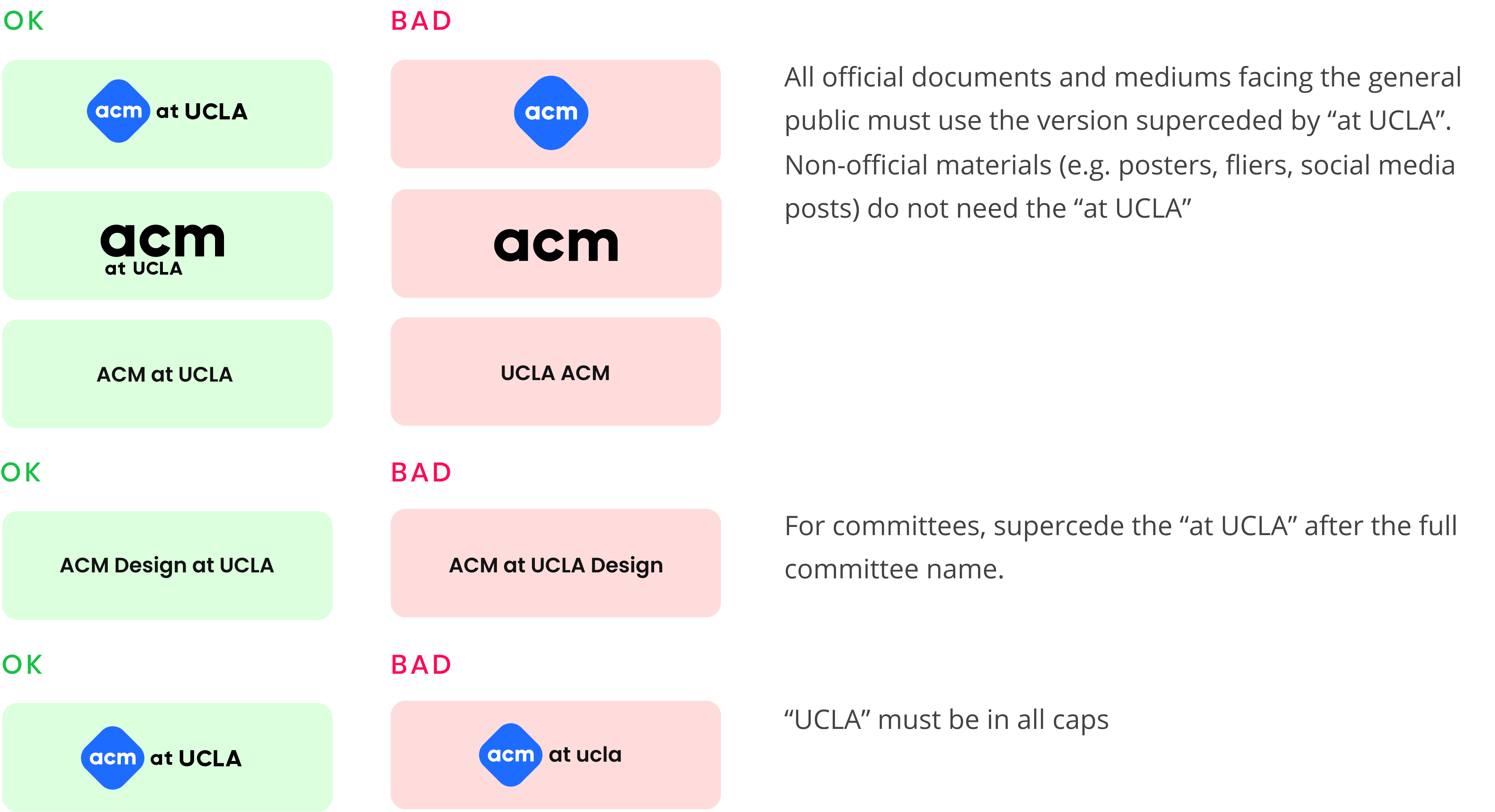
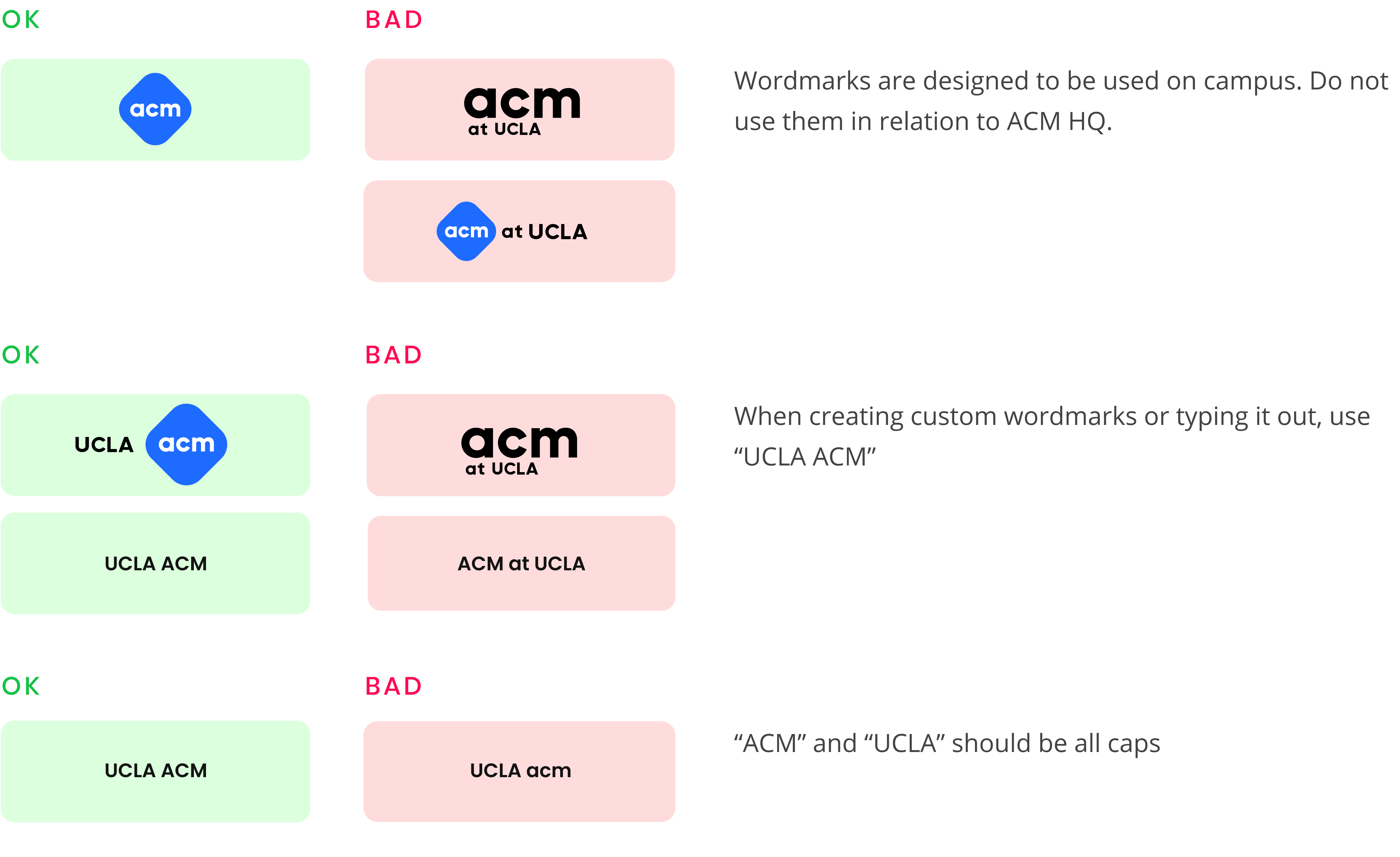
These rules apply for all activities/materials directly dealing with ACM HQ.
Each committee, including the general ACM at UCLA, has 4 colors defined, as well as a “gradient”.
The primary color is the main identy of the committee. As such, they should be used a base color for various UX/UI/graphic design elements, most notably the logomark.
Secondary colors are slight variations of the primary color. They are to be used alongside the primary color to add variety to the overall color palette.
Accent colors are used for certain elements that shouldbe emphasized over others,such as buttons on a webpage.
Linear gradients are mainly used in wordmarks, as well as specific elements that should be emphasized.
Monochrome colors are used for basic UX/UI elements, such as website backgrounds.
New ACM branding recommends light theme. The bottom chart shows a recommended ratios of colors. The exact ratios are not specified to allow flexibility in design.

ACM at UCLA has 4 fonts defined for various uses.

Westwood Sans is a proprietary font made by ACM to be used in wordmarks, and wordmarks only.

Poppins is the header font, used for headers in posters and websites. As such, any text using Poppins should not exceed about dozen words. For longer phrases, use the body font.

Open Sans is the body text, generally used for sentences and paragraphs.

Source Code Pro is used when writing code.
ACM at UCLA, like many other tech-related organizations, predominatly use vector-based art, However, in order to help it stand out from other organizations, there are several key art directions to follow.

Pixel-based art should rarely, if ever, be used. This is to make inmplementations on digital media easier, as well as to speed up production.

ACM branding recommends light theme, and this should be applied to art as well.

The overall color of art should reflect the committee’s color palette - even for things that usually don’t have color.

Do not shy away from using vivid colors, unusual color palettes, etc.

Strike a balance between realism and abstract. Above, the keyboard has detailed bumps, while indivisual letters are removed to avoid clutter.

Whenever possible, create perception of depth using color, gradients, and/or shadows.
Contact Haki or Tomoki.